
Tangle Design System
A design system is a set of standards to manage design at scale by reducing redundancy while creating a shared library and visual consistency across different pages and platforms.
Year: 2023
Role: UI Designer
Client: Tangle (Gaming)
UX/UI methodologies & techniques:
Specific component UX research
UI design
QA of implementation
Style Guide
Pattern library
UI Inventory
UX Audit
Collaborated with a startup company, Tangle, to develop a cohesive design system and a new product. In my role as a UX/UI designer, I worked closely with the design lead and Unity developers to transform designs into reusable components using Figma as the primary design tool. Tangle aimed to create an app that fostered culture and excitement in a remote workplace environment.
The challenge
Every time we started a new project or started a new phase of the project we were creating projects from scratch. This would mean setting up a new components library each time.
This meant we were designing the same components over and over again with the style changing each time to suit functionality.
We needed to:
Recreate old components
Gather all old use cases and create use cases for each component
The benefits of a design system
It’s a single source to view components, patterns, and styles.
New changes for the same projects can be redesigned and managed at scale through the design system.
Design resources can focus less on tweaking visual appearance and more on complex problems/solutions. This ensures that the project and designs are consistent visually and functionally.
Ability to replicate designs quickly by utilising pre-made components and elements.
Reducing the need to reinvent the wheel and eliminating inconsistency.
Reduces wasted designs or development time around miscommunications.
The approach
We started with creating a style guide for the system. Luckily for us this one had already been done. All we needed to do was implement any new changes or elements to the system and link the existing style guide.
The style guide consisted of:
In-page annotations (how we document and layout each component within the library)
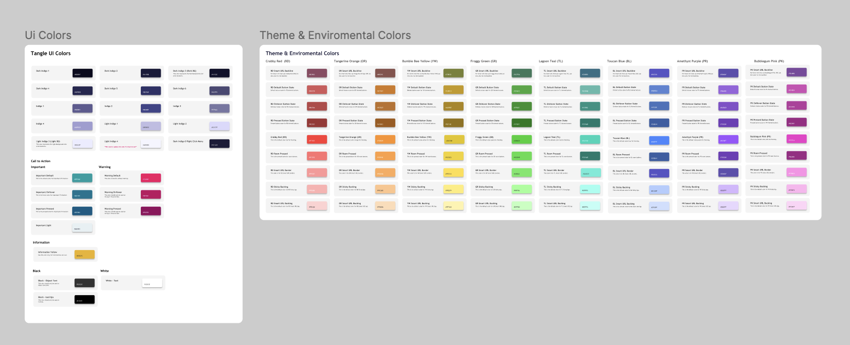
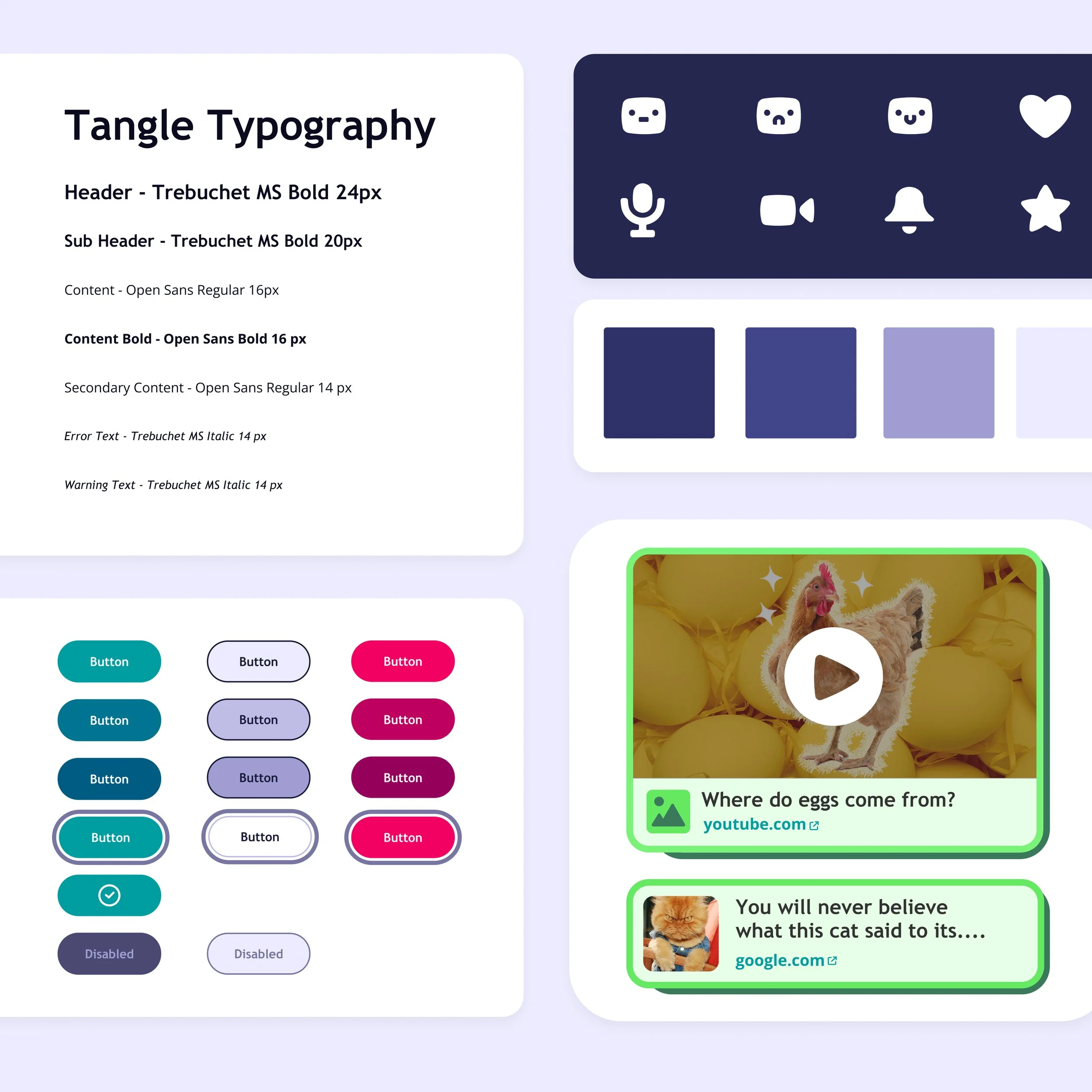
Branding (colours, typography (Web & Mobile, Logos)
Spacing guidelines
Layout grids
Over 100 custom icons and a guide on how to build them
Border radius guidelines
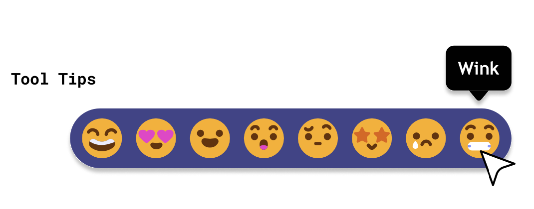
Custom emoji and reactions
These style guides are incorporated into the component library as well, to provide relevant guidance in context.
The component library consists of:
Component name:
A specific and unique UI component name, to avoid miscommunication between designers and developers. This needed to be clear so that the components would work as they were supposed to without error.
State changes:
Recommended defaults and the subsequent changes in appearance.
Note making:
Page annotations and descriptions to understand what component you were looking at.
Breakpoints:
Any size indication and breakpoints for the developers.
Documentation
Documentation is always included on the same page as the component this was to explain any use cases that were created. This consisted of:
A clear explanation for what this element is and how it is typically used, occasionally accompanied by dos and don’ts for context and clarification.
Picture examples so that it was clear what we were talking about
Rules of when to use the component and how to use the component
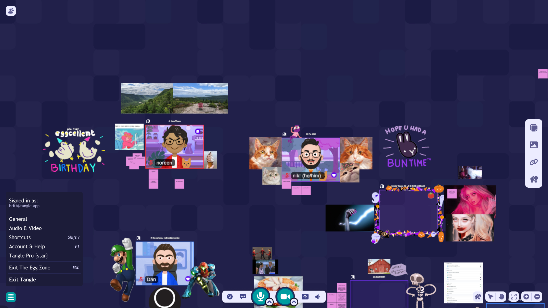
A grid of the world space to understand how to place UI elements to help designers and Unity developers.
After this was created, this helped increase our team productivity both designers and developers by 60% we were able to work faster and more accurately.